When looking for a data visualization tool, you will always look for something that reciprocates your efforts and the nature of your data. You always want to come up with a compelling dashboard that works well for your audience. if you do not choose the right charts for your dashboard it will ultimately put a negative impact on the user experience and usability.
The data visualization tool can now enable you to display insights into two different metrics. Microsoft Excel has the ability to perform work that is meant for two different charting tools at the same time. The chart we are talking about is the combo chart in Excel. A combo chart can enable you to save a lot of space and time when visualizing a couple of different data series. It’s also very easy to create Charts in Excel.
Besides, the chart is pretty easy to use and comes with the features you have always wanted for data visualization. Even though the combination chart stands out as one of the most reliable charting tools, creating it is still a problem for many. Before we begin creating a combo chart, let’s begin by covering the basic aspects that you need to know and allow them to stick into your mind.
What is a Combo Chart?
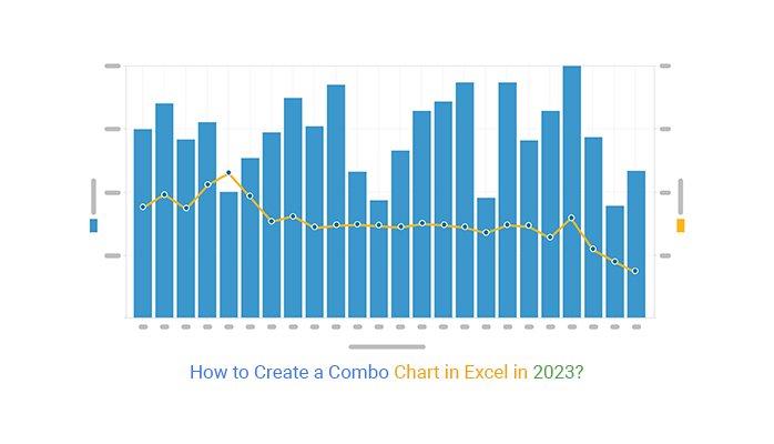
A combo chart, also known as a combination chart, is a particular type of charting tool that combines the column and line chart together to form a single tool. The chart can help you answer questions revolving around your data and uncover insights that you cannot detect with the bare eyes. It gives you a more flexible approach to displaying your data.
Besides, this visualization tool forms the basis of different data visualization tools, such as the Pareto chart, which use the 80/20 visualization design. Besides, there is a wide variety of combination charts in Excel that you need to know. However, different combination charts are designed to accomplish different objectives during data visualization.
It’s advisable to use a combo chart in Excel when your ultimate goal is to validate the relationship between two different data variables with varying magnitude and scales. However, they are related to each other. For instance, you can choose to use a combination chart in Excel to showcase insights into different sales metrics that showcase a common denominator, such as a financial year.
This charting tool can also enable you to showcase insights into the hidden trends and outliers in the raw data and patterns. It uncovers all the underlying information in your data, giving you a better picture of the reality of the data that you are dealing with.
When to Use a Combo Chart
The best time to use a combo chart is when you want to have a lean visualization dashboard that can display a wide variety of data values. Different types of combo charts, such as the double axis line and bar graphs, can be of great importance when you want to display the relationship between two unique data points.
For instance, the chart can help you show insights into the relationship between the forecasted and the actual sales recorded within a specific time period. The combo chart can also assist in extracting comparison insights into different key categories with the aid of highly contrasting color schemes. This is a basic tool that the sales department must have since it can convey insights within the target versus the actual sales revenue within a given financial year.
Also, the sales managers can utilize this chart to uncover either the best or the poorly performing staff. The chart has the capability to display insights into the revenue and the total number of deals that were sealed within a particular year. As a result, you can then use the insights to supercharge the performance of your business and transform your brand.
Manufacture
If the manufacturing industry is your niche, then you can make a combo chart your best friend. The chart can enable you to compare all the units of solids versus the sales revenue within a particular period. The combo chart displays clear data output that business managers can use to make quick decisions to enhance business growth.
Finance
The finance sector is a critical department within any business that has plans to grow into a big brand. A combo chart can enable you to measure metrics such as the billable hours versus the total amount of revenue that has been collected over a particular duration.
Creating a Combo Chart in Excel
Microsoft Excel is one of the most reliable tools to use when creating different types of Combo charts. Most professionals always prefer using Excel compared to other tools available on the web. Microsoft Excel has been available for years and is known for generating some of the best Combo charts when given the right instructions.
Even though Excel is considered more reliable, you need to think beyond it when you want to create compelling and easy-to-interpret combo charts. The tool cannot create a combo chart by default because it does not have this option. However, this does not mean that you should dispose of it away. You can still give it the power it deserves to create a compelling combo chart.
ChartExpo is one of the best third-party applications that you can use to create a combination chart in Excel. To get access to this tool, Excel gives you room to download and use it when attached to it. Here is how you can do this.
- Open your worksheet in Microsoft Excel
- Click on the Insert button located in the main menu.
- On the new menu, tap on the My Apps button and a drop-down menu will appear on your screen.
- At this point, search for ChartExpo within your Microsoft App store. You can then click on the Insert button.
- Tool will be inserted in your worksheet
- You need to log in with your Microsoft account or choose to create a new account if you do not have one.
- Once you enter your details, give ChartExpo permission to get access to your Excel. After you are fully logged into the tool, you will see a detailed chart interface displayed. After you are done with the whole process, you can now get started with creating a combo chart.
Collect your data from its respective sources and upload it on your Excel sheet. Ensure that you recheck the data to confirm that you are dealing with accurate values. Click on the Insert button and open the My Apps section. Open ChartExpo and search for the combo chart within the provided list of charting tools.
You can also use add-ins to create Combo charts in Microsoft Excel.They provide custom features and easy to use interface to quickly create the charts. You can create line and bar charts, line and area charts and many more with ease. You can use custom properties to customize the look and feel of the charts for better user experience.
Bottom Line
Displaying insights from two different data sets should no longer be a tough task. A combination chart enables you to compare two different sets of data. What makes it more interesting is that you can create a combination chart in a matter of minutes without calling for any special skill.
Microsoft Excel allows you to create a combo chart without needing to involve technical experts. ChartExpo saves you the money for hiring technical personnel and gives you more time to work on what matters. With this tool, you can create a wide range of data visualization techniques that solve your data.